Revisions to this Site
I ased my wife, a data analyst and fellow educator for feedback on this site. At the time, the lesson planning page looked like this:
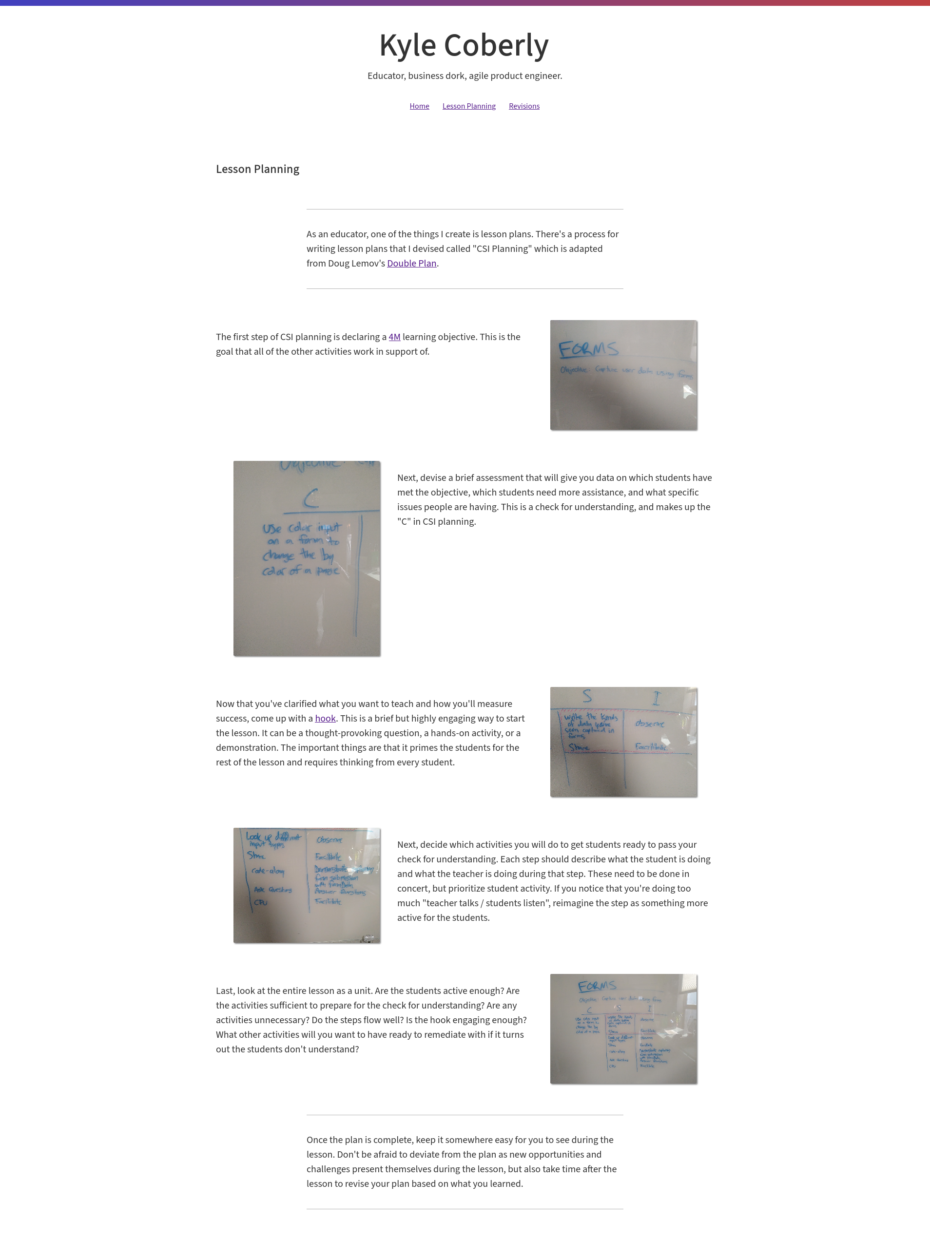
She identified the following layout issues:
- The pictures are too low-contrast
- The heading being left-aligned and the first paragraph being centered looks like a mistake
- Inconsistent sizes on the images leaves large gaps in-between steps
After revising the site to account for this feedback, I ended up with the following layout:
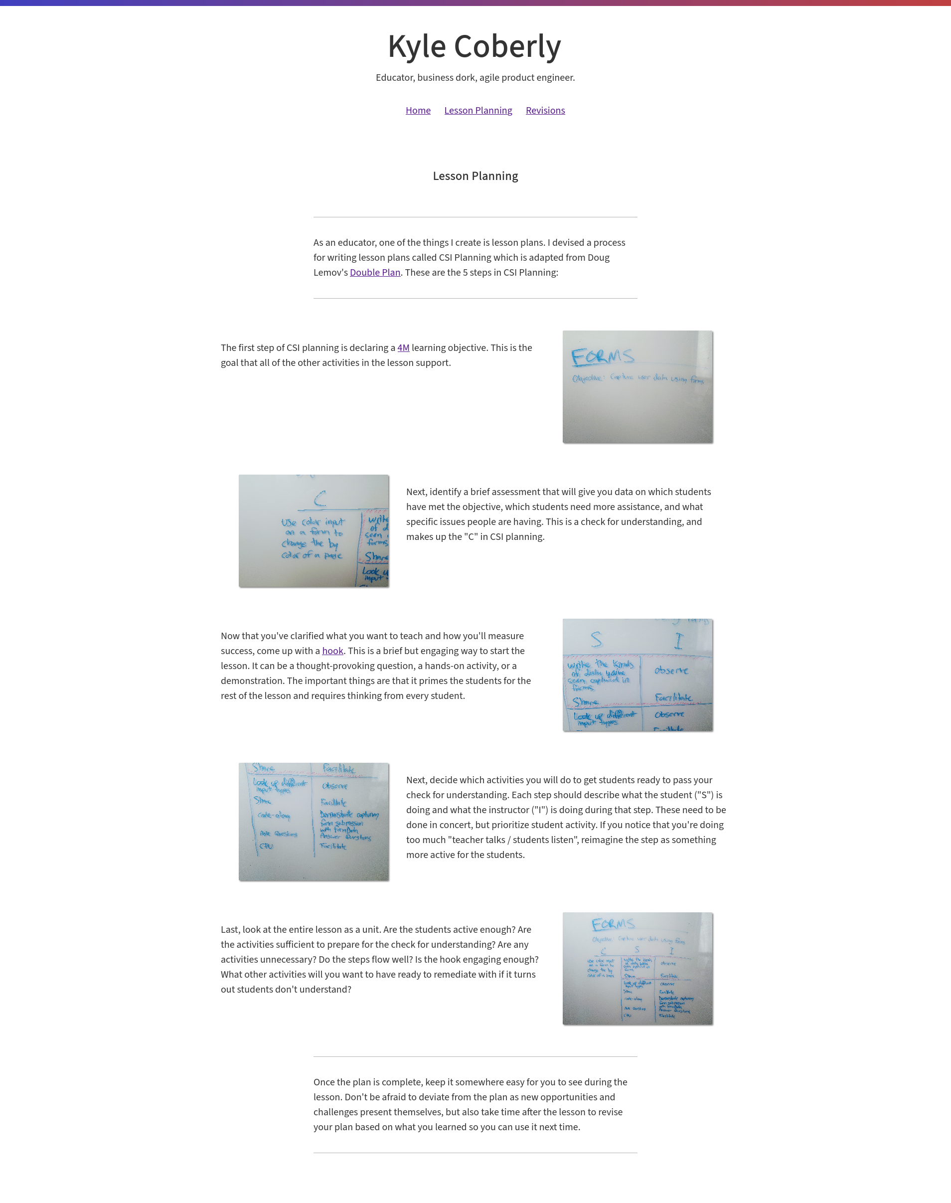
I also updated the copy for clarity.